Welcome to our second installment of Architecture Hell.
As I stated before—these explorations are just that—an exploratory wade into what is and what could have been which aims to say, “hey! you deserve it to have a house that is balanced, calm, beautiful and soothing.”
The houses this week are again in a very wealthy, expensive area of California. I find California an interesting place to look at home design because there is such a dearth of non-colonization aesthetics. It’s true for the whole United States but back East and in the midwest there tends to be recognizable style in respective areas. Maybe because California was stolen from the Indigenous peoples first by Spain, Mexico, and then the United States’ English decedent settlers, there tends to be nothing singularly recognizable as contemporary “California architecture”1. There could be some argument that the Case Study houses built throughout Southern California represent something truly Californian, but they were essentially versions of homes already seen in the midwest and Europe (think Bauhaus, think Fallingwater). On top of that, California has, in its recent history, been a place for fantasy and reinvention—some place that, for better or for worse, was seen as a blank canvas and as a place where one could reinvent oneself.
What this means is there are some lost souls in house form. Some people come to the design process dreaming of Spain and build “Spanish Style” homes. Some, like in Architecture Hell 1, feel the Mediterranean vibes and build a “French Manor”. Others feel “Italian”, others Mid-Century Modern, others want the modern villain house of their childhood fantasies and some want a mash-up of all those combined.
A recent trend I have spotted in California is something tragically titled the “Modern Farmhouse”. Every time I see one of these homes I want to walk up the runway-like illuminated front path, knock on the oversized black door and ask the occupants, what farm are we referring to here? Could this be the fault of well-meaning branding geniuses Chip and Joanna Gaines with their transparent interest in raising the stock prices of SHIPLAP? Could this be research-oriented designers who knew that Stanford University used to be called “The Farm” and are drawing inspiration from the that? It is clients who grew up on farms and miss the feeling of aggressive Americana mixed with Home Depot?
I think you’ll recognize this style. They pepper bougie suburbs with their glaring white siding and insistence upon taking up the entire lot. For some reason they are always black and white and always have at least one dramatically pitched roof. They can skew custom, they can skew McMansion, and if you need a reference point, Dorit of RHOBH lives in a particularly atrocious example (forgive me Father for I have referenced Real Housewives twice now….). A curse upon whomstever thought to put those light fixtures in the eaves.
The reason I find this style so offensive, and I feel so deeply for the clients who no doubt pay a lot of money to live in them, is they so often abuse the canon. I posit that what makes a farmhouse attractive is the nostalgia, the idea of an idyllic home in a vast field, the notions of simpler times on a porch, the doodles of houses we learn to draw as children look like this. It is rooted in the American fantasy of a home, of family and of success. You work the land, live on the land, and via the American dream, own the home situated snugly in the rustling grasses and elms.
Instead, these houses are grossly oversized, squeezed onto lots with no thought to how they will appear or feel in any other context than the online real estate listing. The rooms are large and well-appointed, but seem to crush each other in their attempt to flow indoor/outdoor, leaving windows, rooflines and pop-outs to fend for themselves wherever they may fall. To fit these bulbous structures on the lots, any shred of mature planting or tree has been removed, replaced by neat sod and concrete pavers. Open a window and you may hit a neighboring wall or the adjacent fence. And forget privacy—most boast large windows directly at street level so any neighbor on a causal walk can watch you hosting dinner parties or lounging watching TV.
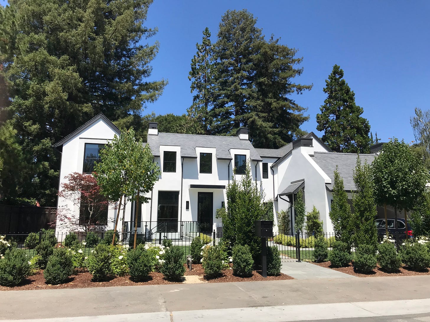
The first example I am going to focus on has a few redeeming qualities—they managed to save a redwood tree, and I spotted that they have a cute dog. As you can see—this house takes up almost the entire lot:
The immediately obvious whoopsies are the mysterious triple pop-outs along the front facade on the second floor. What does that look like inside? Why not just one large bay window, why three mini ones? Next is the skinny door leading to the driveway—why is it so slim? Could not the flanking windows been removed to make way for a normal-sized door? And third is something I see a lot now and am starting to think is a way to market poor roof drainage as a fashion statement—why oh why Lord are the drain-spouts black? Why must they contrast and draw attention to themselves? Are their presence alone not offensive enough, must we also use them to haphazardly criss-cross the exterior of this white home in dark lines?
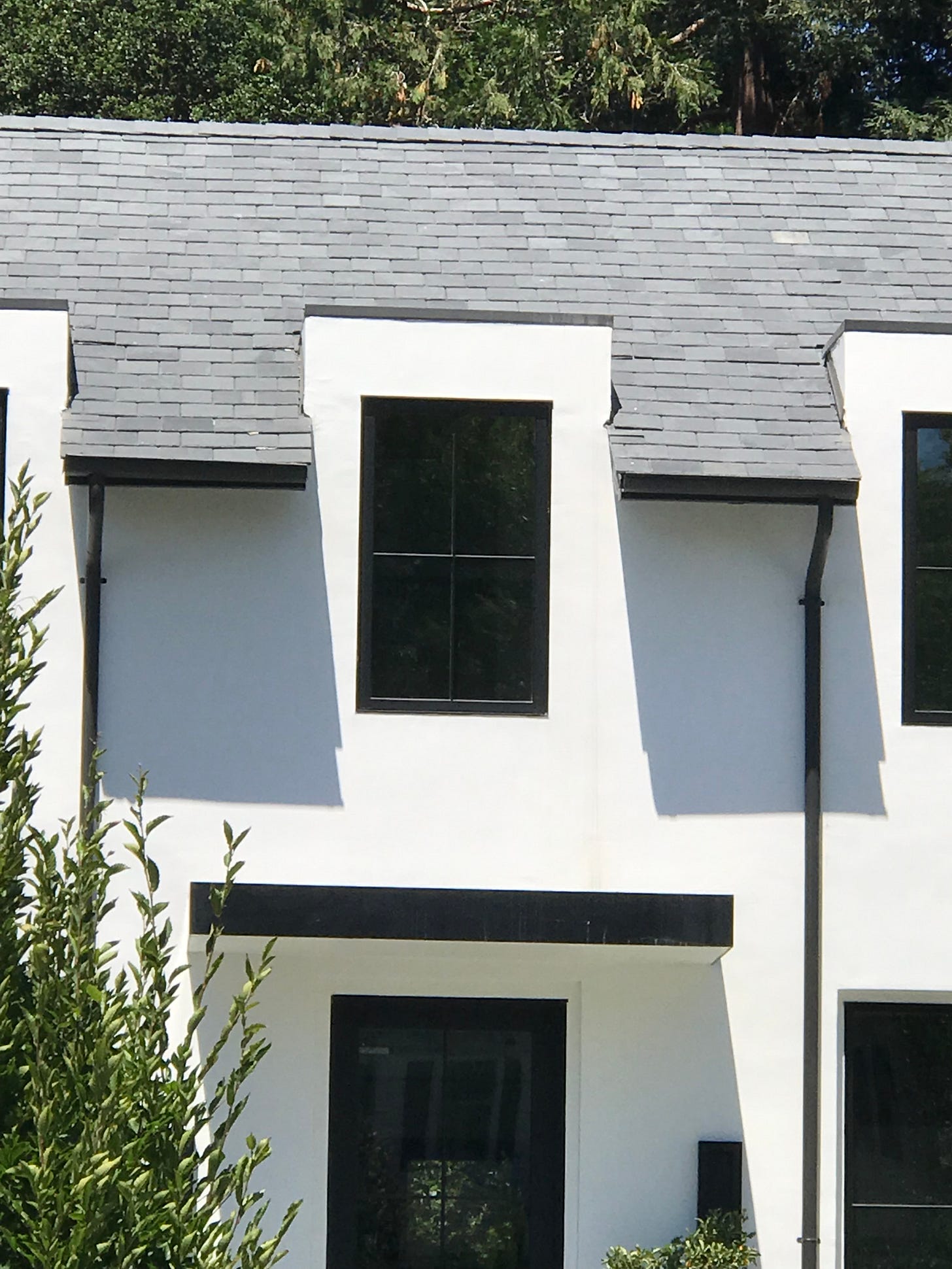
The next house is around the corner and although does not have its “shiplap” armor, is worth mentioning because I think we’re looking at a French country house meets Modern Farmhouse and it could have been a romantic synthesis, as I am sure the client wanted, but so much has gone off the rails that they must feel the topsy-turveyness at every grey-oak hardwood floor turn.

Again, pitched roof chaos. Again, black and white starkness. And, again we have a little trio of lost windows—these with their protective hats covering the space between them, instead of the glass themselves. Astute observers will also note the signature black drain-spouts harshly set against the white exterior, and for extra points, there is a chimney over a window, which appears to be in the garage.

All of these elements squish together to leave us feeling the lack of harmony and, in my case, an unquenchable thirst to see a home in balance. Once, I spotted a Modern Farmhouse that achieved that harmony—it fit the lot size, was private and appropriately settled amongst mature trees, and I realized why this is such a frequently mimicked style. It was homey.
I hope this exploration was, if nothing else, entertaining. Even though these homes were not soothing, I still insist that part of learning what is soothe is learning what is not, and why. Let’s strive toward the buildings we as residents deserve, and that enhance our neighborhoods and bring soothe, not chaos, into our architectural worlds.
Kirker, Harold. “California Architecture and Its Relation to Contemporary Trends in Europe and America.” California Historical Quarterly, vol. 51, no. 4, 1972, pp. 289–305. JSTOR, www.jstor.org/stable/25157399. Accessed 2 Sept. 2021.


What were they thinking with those downspouts? Maybe if they were copper, but black, eww, awful.